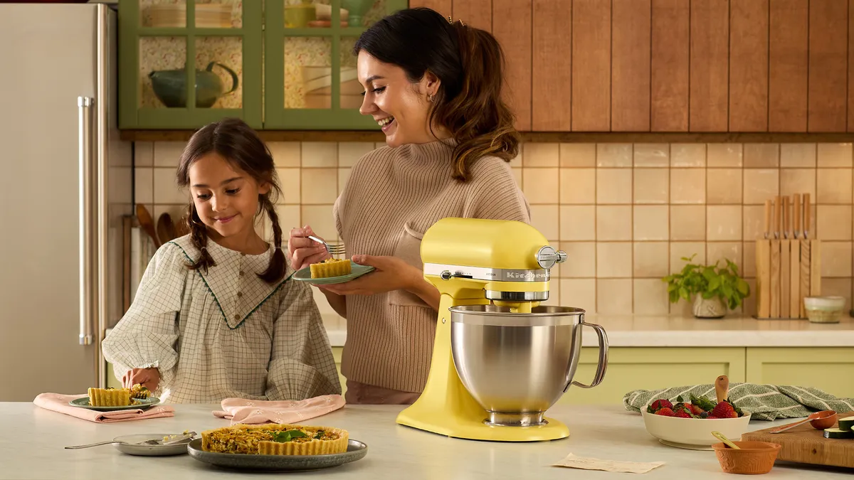
Counter space has become personal space, and few kitchen tools prove it faster than a mixer people leave out on purpose. The Artisan Stand Mixer is not drawing attention only because it beats dough or whips cream. It is getting shared because the new shade choices let U.S. home cooks treat a practical appliance like part of the room. KitchenAid’s own color pages now highlight shades such as Sun Dried Tomato, Wild Blueberry, Iron Ore Bronze, and Oat, while the brand’s 2026 Color of the Year is Spearmint. That gives buyers something more emotional than a spec sheet. They can picture the mixer beside white oak cabinets, a butcher-block island, or a tiny apartment cart before they picture cookie batter. For readers tracking kitchen trends, home and lifestyle product visibility has turned into part design choice, part buying signal, and part online identity.
Why the Artisan Stand Mixer Color Rush Feels Bigger Than Bakeware
A mixer used to be judged by what it could handle: bread dough, frosting, mashed potatoes, holiday cookies, maybe pasta if you owned the attachment. That still matters. Nobody wants a pretty appliance that groans through pizza dough. But the current color buzz proves something U.S. shoppers already know from sneakers, phones, and coffee makers: when function is stable, finish becomes the story.
The non-obvious part is that color does not make the mixer less serious. It can make the buyer more attached to it. A matte black tool may feel like a workhorse. A mint green one may feel like a mood. A deep red one may feel like the center of the kitchen during December baking. Same counter footprint. Different daily feeling.
The color choice now says something about the kitchen
American kitchens are carrying more visual pressure than they did ten years ago. Open layouts mean the kitchen is no longer hidden behind a swinging door. It is where guests stand, where phones come out, where birthdays start, and where weeknight dinners are half-made while someone answers a text.
That shift makes a stand mixer different from a toaster you shove into a cabinet. A 5-quart mixer is heavy, so many owners leave it out. Once it stays on the counter, it becomes part of the room. The shade has to live beside tile, hardware, cabinet paint, and morning light.
This is why the new colors are easy to share online. Sun Dried Tomato reads warm and grown-up. Wild Blueberry feels rich without screaming for attention. Iron Ore Bronze suits moody kitchens with stone counters. Oat works for renters who want calm without another plain white appliance. KitchenAid’s official page describes these newer finishes with texture and tone, which tells you the brand is selling a look as much as a tool.
Social media rewards appliances that look intentional
A mixer going viral sounds silly until you think about what gets saved on Instagram, TikTok, and Pinterest. People save rooms. They save countertop corners. They save “Sunday reset” videos where every object looks chosen, even the flour canister.
That makes the mixer a prop with a job. A home baker in Austin can film cinnamon roll dough on a butcher-block island, and the color of the machine helps set the tone before the dough hook even turns. A New Jersey apartment renter can place a soft green mixer on a rolling cart and make a small kitchen look planned instead of cramped.
The counterintuitive insight is this: the frenzy is not only about owning the newest shade. It is about proof that the buyer knows their own taste. In a market packed with stainless steel boxes, a confident color feels like a small rebellion. Quiet, useful, and easy to photograph.
The New Shades Fit How Americans Actually Decorate
A color collection works only when it fits real homes, not showroom fantasies. Most U.S. kitchens are not magazine spreads. They have mail near the coffee maker, kids’ cups drying beside the sink, and one drawer that refuses to close. A mixer shade has to survive that reality.
That is why this color moment has legs. The shades do not all chase the same buyer. Some are bold enough for maximalist kitchens. Some are soft enough for neutral homes. Some look better with dark cabinetry than with white subway tile. That range matters because American interiors are no longer locked into one safe look.
Warm colors are replacing cold appliance sameness
Stainless steel had a long run because it felt professional. It still works. But too much steel can make a kitchen feel like a rental lobby. Warm mixer colors soften that effect without forcing a full remodel.
Take Sun Dried Tomato. It can sit in a cream kitchen and act like the one rich note in the room. It also works beside walnut, brass, terra-cotta tile, and dark green cabinets. That is more flexible than bright fire-engine red, which can overpower a small counter.
The same idea applies to Oat. It is not a loud color, yet it solves a common problem: people want warmth but fear regret. A soft neutral mixer gives the counter shape and texture without shouting. For shoppers comparing finishes, a guide like small kitchen appliance trends can help them think beyond the first photo they liked.
Blue and green tones match the current calm-kitchen mood
Wild Blueberry and Spearmint sit on different ends of the mood scale, but both fit a larger design habit: people want kitchens that feel less harsh. Blue brings depth. Green brings freshness. Both feel less expected than silver and less risky than hot pink.
Spearmint is a clear example because KitchenAid named it the 2026 Color of the Year and describes it as a mint green shade. That kind of annual color push gives shoppers permission to buy something playful without feeling childish. It also gives content creators an easy hook: here is the color everyone is noticing, and here is how it looks in a real kitchen.
The surprise is that calmer colors can spread faster than loud ones. A shocking shade grabs one second of attention. A livable shade earns saves, shares, and “where did you get that?” comments. That is the difference between noise and desire.
Performance Still Decides Whether the Hype Lasts
Color may start the conversation, but performance keeps the mixer from becoming an expensive decoration. This is where KitchenAid has an advantage. The stand mixer already has a long reputation in U.S. kitchens, and the brand’s history page notes that stand mixer colors became part of its story back in 1955. Color is not a random add-on. It is part of the product’s identity.
Still, buyers should slow down before chasing the shade everyone is posting. The right mixer has to match your cooking life. A person who bakes twice a year needs a different level of commitment than someone making sourdough, buttercream, and pasta every weekend.
The mixer earns counter space through repetition
A stand mixer is not small. It demands space, and in many U.S. homes, counter space is a daily fight. Coffee maker, air fryer, knife block, fruit bowl, charging cables. Something has to lose.
That means the mixer should earn its spot through use. If you bake cookies, cakes, pizza dough, mashed potatoes, and whipped cream often, keeping it out makes sense. You avoid the awkward lift from a low cabinet, and the tool becomes part of your routine.
Here is the honest test: if the color makes you more likely to use the machine, that is not shallow. It is practical. A tool you like seeing is a tool you are more likely to touch. For a buyer building a first serious kitchen, home baking gear guide can help sort the mixer from the extras that can wait.
Attachments make the purchase feel less like a baking splurge
Many buyers think of the mixer as a baking tool, then later realize it can grow into other tasks. The front hub is the quiet reason the machine stays relevant. With the right attachment, it can help with pasta, grinding, slicing, shredding, or ice cream prep.
That does not mean every attachment is worth buying. Some end up living in the back of a pantry. The smart move is to buy for the recipe you already make, not the fantasy version of yourself who makes fresh ravioli every Thursday.
The non-obvious value is not “more features.” It is fewer excuses. If one machine can handle holiday cookies, birthday cake, pizza night, and a summer ice cream experiment, the color becomes the part you enjoy looking at while the motor does the plain work.
How to Choose a Shade Without Regret
The social media rush can make every color feel urgent. That is the trap. A mixer is not a seasonal candle. It may stay in your kitchen for years, so the best shade is the one that fits your room when the trend moves on.
Start with your fixed surfaces. Cabinets, countertops, backsplash, flooring, and hardware matter more than a viral video. A mixer can either blend, contrast, or anchor the room. The mistake is choosing a shade because it looked perfect in someone else’s lighting.
Match the finish to your real kitchen light
Light changes color more than people expect. A mint shade can look clean in bright natural light and cooler under LED bulbs. A deep blue can look rich near a sunny window and almost black in a shadowed corner. Bronze can glow near warm cabinet lighting but flatten under harsh overhead light.
Before buying, pull up product photos on your phone while standing in your own kitchen. Look at the shade near your cabinets and counter. It is not perfect, but it is better than judging from bed at midnight with the screen brightness turned up.
For example, a condo kitchen in Miami with glossy white cabinets may handle Spearmint beautifully because the room has enough light to keep it fresh. A narrow Boston rental with limited daylight may look better with Oat or a deep shade that feels intentional rather than washed out.
Buy for your future taste, not a one-week trend
A social media frenzy can pressure shoppers into treating color like inventory they must grab before it disappears. Some limited or seasonal shades may move fast, but panic is still a poor design plan. The better question is simple: would you still like this shade if nobody posted it tomorrow?
If yes, buy with confidence. If no, step back.
One useful trick is to imagine the mixer during three moments: a normal Tuesday morning, a holiday baking day, and a day when your kitchen is messy. If the shade still feels good in all three, it belongs. If it only works in a perfect photo, it may become visual clutter.
That is the final twist. The best color is not always the boldest one. It is the one that makes the kitchen feel more like yours when no one is watching.
Conclusion
Color trends move fast, but some products are built to hold attention longer than a feed cycle. KitchenAid has the rare advantage of selling a tool people already trust, then giving buyers enough shade choices to make that tool feel personal. That is why the current buzz feels less like a random internet spike and more like a design signal.
The Artisan Stand Mixer sits at the center of that signal because it blends memory, usefulness, and style in one heavy object. For U.S. home cooks, the decision is not only about which shade looks best in a product photo. It is about which one makes the kitchen feel easier to enjoy, more lived-in, and more honest to the person using it.
Choose the color that fits your light, your habits, and your patience for trends. Then use the machine enough to let the finish collect real memories, not only likes.
Frequently Asked Questions
What is the best KitchenAid mixer color for a small kitchen?
Soft neutrals, pale greens, and muted blues often work best because they add personality without crowding the room visually. Oat, Spearmint, and similar shades can brighten a small counter while still feeling calm beside white, wood, or light gray cabinets.
Is a KitchenAid color collection worth paying more for?
It can be worth it if the shade makes you more likely to keep and use the mixer long-term. Performance should come first, but color matters when the appliance stays visible. Avoid paying extra for a shade you may dislike after the trend fades.
Which KitchenAid mixer shade is easiest to match with cabinets?
Neutral shades are usually the safest match because they work across white, cream, gray, oak, and painted cabinets. Oat-style tones are flexible because they bring warmth without locking the kitchen into one strong color direction.
Are darker KitchenAid mixer colors better for busy kitchens?
Darker shades can hide minor smudges better than pale glossy finishes, especially near flour, cocoa powder, and greasy fingerprints. They also anchor open kitchens with dark hardware or stone counters. The tradeoff is that dust may show more under bright light.
Why are KitchenAid mixer colors so popular on social media?
They photograph well, sit on the counter, and make a kitchen look more personal. A stand mixer is large enough to affect the room’s mood, so creators use it as both a working appliance and a design detail in cooking content.
Should I choose a KitchenAid mixer based on trend or kitchen style?
Kitchen style should win. A trend can help you discover a color, but your cabinets, counters, lighting, and daily habits should decide the purchase. A shade that fits your home will age better than one bought for a short online moment.
What size KitchenAid mixer is best for most home bakers?
A 5-quart tilt-head model fits many U.S. home bakers because it handles common cakes, cookies, frosting, and doughs without taking over the counter. Heavy bread bakers or large families may prefer a bigger bowl-lift model.
Can a colorful stand mixer help kitchen resale appeal?
It should not be treated as a resale upgrade because it is removable personal property. Still, a well-styled mixer can make listing photos feel warmer and more lived-in. Buyers respond to kitchens that look cared for, even when the appliance is not included.